The 10 most harmful mobile SEO mistakes

Here are 10 mobile SEO mistakes you should avoid to ensure you remain in the SERPs, drive more traffic to your site, and keep visitors happy.
Google has been delivering a consistent message since “mobilegeddon” in 2015: they are switching to mobile-first indexing, and you need to be mobile-first.
Mobile-first means that Google is crawling your mobile site – and is often only looking at your mobile site. Even if your desktop site is the best, if it doesn’t offer an excellent mobile experience, Google will not rank you well.
Google is planning to switch to 100% Mobile-First indexing in 2021, and even now is only cleaning up straggling sites. Google is likely crawling your website mobile-first.
Mobile SEO is more important than ever. Pay attention to Core Web Vitals, checking your mobile content for opportunities, and fixing mobile UX issues.
Here are 10 mobile SEO mistakes you should avoid to ensure you remain in the SERPs, drive more traffic to your site, and keep visitors happy no matter what device they’re using.
1. Core Web Vitals: Slow Site Speed
It’s crucial for your site to be fast: not only fast to load, but fast to interact.
Page load speed is a ranking factor: two-thirds of Google’s Core Web Vitals update deal directly with site speed (Largest Contentful Paint and First Input Delay).
Even outside of search engine ranking factors, according to Google research, 53% of people will abandon a page if it takes longer than 3 seconds to load.

Your site should be rendering every page in less than one second so these fixes can help speed up your mobile site:
- Minimize requests and redirects: Keep pages clean and simple. Eliminate as many 301 redirects as possible, remove unnecessary elements from your page, optimize your HTML code, and minify anything that might slow site speed like CSS and JavaScript.
- Resize and compress images: You can use built-in tools in WordPress to automatically resize images for you and tools like compressor.io to compress your file size.
- Check your hosting solution: Cheap third-party hosting solutions won’t give you the site speed you need to host vast volumes of traffic. This is especially true for ecommerce.
- Check your progress: Use Google’s PageSpeed Insights or Lighthouse as a quick and easy check of your website’s performance.
- Use new native web technologies like lazy-loading to delay loading unnecessary or larger files.
2. Core Web Vitals: Interstitials
In 2017, Google announced that
“pages where content is not easily accessible to a user on the transition from the mobile search results may not rank as high.”
At the time, this change didn’t have a significant impact on ranking. But times have changed.
Intrusive Interstitials are interstitials – pop-up ads, newsletter sign-ups, and other banners – that interfere with the user accessing the content on your site.

In 2021, this signal was partially extended into the Cumulative Layout Shift (CLS) metric.
Cumulative Layout Shift is part of the Core Web Vitals with the goal of measuring the overall layout shifts that occur on a page as it loads. This covers things like pop-ups shifting content down, interstitials moving content around, and other irritating user-unfriendly UX.
Any page that provides a poor user experience could rank lower in organic search. This includes:
- Popups that cover a page’s primary content, regardless of whether that occurs as soon as a user clicks through from Google search results or occurs as users scroll through the page.
- Standalone interstitials that are difficult to dismiss – especially if accidentally clicking these interstitials redirects you to a new page.
- Deceptive layouts, where the above-the-fold portion tricks users into thinking they’re viewing an interstitial.
Note that there are some exceptions to this rule. Interstitial ads that are not adversely affected by the new ranking signal include:
- Legally necessary interstitials, including those for age verification and cookie usage.
- Login dialogs for unindexable content (e.g., private content like emails and content behind paywalls).
- Reasonably sized banners (e.g., the app install banners provided by Safari and Chrome). Generally, these take up no more than 20 percent of a screen.
3. Missing Content: Blocked Files
If your mobile site is drastically different from your desktop site, you may find that there’s content missing between them.
Googlebot should be able to crawl your website like an average user, which means restricting access to JavaScript, CSS, and image files on your website can potentially harm your rankings.
Check your website’s robots.txt file to see if any essential elements are disallowed.
Go to Google Search Console and test your robots.txt file.
Use Fetch by Google to ensure you have no further indexing issues and the mobile-friendly test for mobile-specific issues.
You should not only check your desktop and mobile URLs but the difference between the two.
4. Missing Content: Unplayable Content
Before you include video or multimedia on your page, consider how it will affect your site speed and whether your video embedding is playable on all devices.
Also, include a transcript whenever possible. This will assist both Google (for indexing) and users who need closed captioning.
If you wish to include animated content on your website, Google recommends using HTML5. You can easily create these animations in Google Web Designer, and they should be supported across all web browsers.
You should make sure any animations on your site achieve a good Cumulative Layout Shift threshold.
5. Missing Content: Bad Redirects/Cross Links
Faulty redirects constitute a significant issue in websites that haven’t been optimized for mobile. This is especially true on websites with separate desktop and mobile URLs.
Typical areas of improvement include:
- If a mobile user mistakenly lands on the desktop version of your website, redirect them to the mobile version of the page they were seeking. They should not be redirected back to your mobile site’s homepage.
- If you do not have a smartphone equivalent of your desktop pages, remedy that ASAP. Until those pages are live, you should leave users on your desktop page as opposed to redirecting them to your mobile homepage.
- Mobile users who request dynamically generated URLs should be taken to an equivalent mobile URL that will properly display the information they’re seeking.
- Mobile users across all devices should be served the same content.
- Avoid mistakenly linking to desktop-optimized versions of your pages from your mobile URLs.
The easiest way to avoid these issues is to make your site responsive, rather than a separate domain. This avoids some of the most common mislinking issues.
Verify your mobile site with Google. This will help you isolate mapping issues and detect crawling errors that you can later correct in Google Search Console.
6. Missing Content: Mobile-Only 404s
Similar to the above, users on the desktop and mobile versions of your site should be able to access the same content. If Google can’t see content on mobile, it cannot see the content.
You need to remedy any instance in which mobile users receive a 404 error while trying to access a page that desktop users can see.
Avoid linking to broken or missing content, and ideally, crawl your site from a mobile user-agent to find any 404s.
7. Missing Content: Structured Data
Google is always heading in the direction of rich, accurate, and instant answers to queries.
Using schema.org to provide those answers will give you a leg up in mobile search results.
If you aren’t yet using Schema or Structured Data markup to categorize your content, then you’re missing out on a critical driver of organic CTR. Google and its users tend to respond to rich snippets that showcase examples of the information they’re seeking.
Your rich snippets may not show up in search results for many reasons. Improper mobile implementation is one of those reasons.

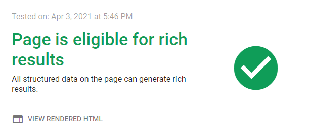
You should use the Rich Snippet tool and Structured Data testing tool to ensure your structured data is well-maintained across the site.
8. Bad UX: Not Specifying Mobile Viewport
Mobile screens come in all shapes and sizes, so if you don’t specify the correct viewports using the viewport meta tag, then your users may experience pages improperly fitted to their device.
Common mistakes include:
- Using fixed-width viewports, which are only optimized for certain devices.
- Poor minimum viewport parameters, which leave users with smaller devices high and dry.
Fortunately, these are relatively easy problems to fix:
- Enable user scaling.
- Control your page’s basic dimensions and scaling using the meta viewport tag.
- Match the screen’s width in device-independent pixels with width=device-width.
- Include initial-scale=1. This ensures a 1:1 relationship between CSS pixels and device-independent pixels.

These fixes don’t only help mobile users and crawlers, but are essential for accessibility as well.
You can also use CSS media queries to style your page differently for small and large screens. For more information, visit the Google Developers blog on Responsive Web Design Basics.
9. Bad UX: Poor Mobile Design
Lots of people get mixed up between “mobile-first” and “mobile-friendly.”
Mobile-first means that Google is going to crawl your mobile site before it ever crawls your desktop site, and your mobile site is what it cares about.
Mobile-friendly means your site is designed well for mobile devices.
You don’t have to be mobile-friendly to be mobile-first, but you have to be mobile-friendly to succeed in a mobile-first world.
So design for smartphones and tablets, not the desktop experience.
Avoid illegible fonts, small font sizes, and on-screen clutter.
Space the elements of your pages so that mobile users aren’t at risk of clicking the wrong link or button.

10. Responsive Strategies: Not Cross-Checking Metrics You Rely On
Understand how the tools you use daily work and how they calculate the metrics you rely on.
When you’re optimizing – whether for mobile or desktop – make sure you use an excellent site auditing tool to find your gaps.
Check your content, your links, your title/meta tags, your schema markup, etc. – everything that will play a role in your website’s success. And make sure you’re comparing desktop vs. mobile.
At the same time, understand that even when different tools boast similar functions (e.g., site audit), they often deliver measurably different results. Cross-check your results against another tool’s results; you might be surprised by how much they differ.
Make sure you understand how each tool arrives at the metrics they churn. This will help you identify the numbers that matter most to your business so that you can rely on the metrics that matter.
Responsive SEO
Desktop and Mobile SEO all start in the same place: usability.
The secret to any successful SEO strategy lies in a solid understanding of your audience. This research should be the backbone of everything you do – SEO, content, site design, etc. If you know how consumers behave online, you’ll be better able to appeal to your audience.
Not understanding your customers leads to many of the most common SEO mistakes, whether it’s choosing the wrong keywords, using headlines that address the wrong pain points, or promoting on the wrong channels.
Bottom line: You can avoid all of these mistakes and have a team working tirelessly to optimize your mobile SEO, but all of these efforts will fall flat if your content doesn’t appeal to your target audience.
Do yourself a favor and use your favorite tools to tap into the conversations your customers (and your competitors) are having about your brand. Get to know your core offer and your audience intimately. Then you’ll be ready to build an amazing and optimized mobile website.
___
by Aleh Barysevich
source: SEJ

